
The plate itself is pretty neat. It's the black, which is generally the least attractive of the plates in my eyes, but the card is Seneca's 2003 Topps Pristine #130 which is the one with the big shield:
 I especially like the little dot between Seneca's legs. That's where the Pristine logo goes, and I'm curious if it shows up as an image on other plates.
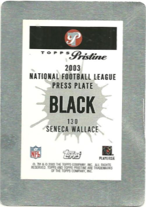
And here's the back - very similar to my Pristine #131 Cyan with the splatter effect:
 Neat right? I thought so. Huzzah for progress! Let's hope it continues!
Way cool.
ReplyDeleteThat's a great looking plate. A lot of plates can be very underwhelming, but that's a beauty.
ReplyDeleteThanks! I love the backwards name and team and that circle a lot. And the shield is awesome as well.
ReplyDeleteNice!
ReplyDelete